
After resisting it for a long time, I decided to plunge into using agentic AI tools to help me with various tasks. Here is a synopsis of where we are at in late March, 2026:
Task: Update python code written 7 years ago to current libraries
Description: one of my initial jobs at work was to write automation that would mash up data from various financial sources, do some baseline analysis, and produce a report, with charts alerting the recipient to specific market conditions. Although this has been running for seven years, there is some maintenance when sources change location or presentation of data. Recently, there has been interest in making its reporting available to an outside audience. As a result, I’ve had some interest in ensuring the code base is modernized.
Grade: A- This was my first foray into this sort of thing, so I spoon fed individual report types and checked the results each time.
- It recognized and corrected all the corrected all the deprecated Pandas functions like chained assignment and filling (e.g., .fillna(method=”bfill”) -> bfill()), much faster than I could do. It also identified some opportunities to replace loops with vectorized functions that did not exist when this was written.
- When I work with Matplotlib, I feel like 95% of my time is taking the standard plot and tweaking it the way I wanted. It was very helpful to iterate with Claude by uploading the chart produced, describing the issue, and having it revise code. Later, I had it tackle a problem I’d spent a lot of time on but could not seem to get working: how to rotate column headers on a table 270 degrees. It helpfully deduced I was calling contradictory functions.
- Not all of its output was correct, however. It stumbled the most when it attempted to simplify reporting logic.
Task: Resolve field discrepancies in my QSL (ham radio contacts) stored online.
 |  |  |
| Maidenhead Grid Squares | US Counties | US States |
Description: As I mentioned before, logging contacts accurately is complicated. One aspect that has bugged me for a while is the data discrepancies in QRZ.com, of which there are three types:
- Discrepancies in certain data like Grid Square, County, or State. I may log grid CN87 but the other party logged CN97. I don’t really care, and what I would prefer is simply an “Accept All” option that does not exist, nor will it ever. This problem seems to occur more now that I participate in Parks on the Air as logs are created with conflicting information. (That said, I’m certain there are other causes, I just haven’t invested time to determine where the bad data starts.)
- Correcting information I logged originally because I didn’t know better. For example, I was visiting Rochester, NY, and set up my radio while my kid was sitting in on a class. All of the QSOs were logged with my home location.
- Reconciling information between Logbook of the Web and QRZ.
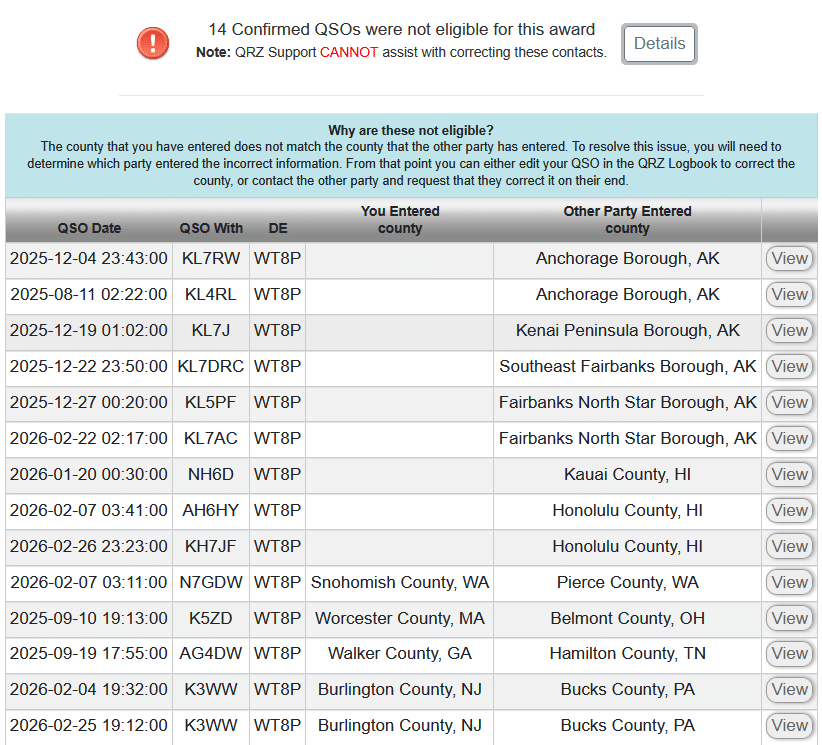
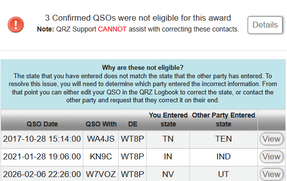
While the data can be corrected within QRZ.com, doing so is a huge pain in the ass, averaging 9 – 13 clicks per record. For the first two months of 2026, I had 90 records where there were differences. I know it’s a niche problem, but it very much bugged me. I did see there was a QRZ API, but initially overlooked how one actually updates existing data. To use it, I would have to write a bunch of other utilities to decode ADIF files, do comparisons, etc. It was a task I was not looking forward to, nor was it especially important.
Grade: B It seemed to have a basic understanding of what I wanted to do, and was competent at writing python code faster. However, this would not have succeeded without my deep understanding of logging and data flows. In other words, I would not trust it to “vibe code.”
- Early on, I had to instruct to add some debugging information so we could see what the API call was returning, which helped it realize that we needed to html decode the html-encoded response. Later, we had issues with pandas converting the QRZ log identifier (a large integer) into floating point representation.
- It was able to ingest the sparse documentation of the QRZ API and make calls. We both missed the API having an “OPTION=REPLACE” on the INSERT keyword, and were deleting then reinserting records, which won’t work with “locked” records used for awards. The QRZ API lacks examples.
- Sometimes what QRZ showed was different from the underling ADIF format. For example, it listed a QSO as being “King County, WA” whereas the ADIF format is expecting it reversed and without “County,” e.g., “WA,King”. For Alaska, we had to remove “Borough.” (And probably, “Parish” for Louisiana.)
I would estimate that I’ve spent about six hours iterating over the request, correcting and refining what it produced, but now I have something I can reuse for when this issue occurs next.
Task: Generate a PowerPoint presentation outline from prompts
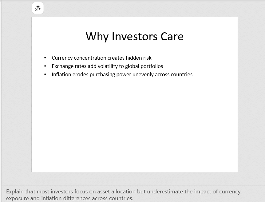
For this task, I was running PowerPoint and using both CoPilot (as it exists within Microsoft Office 365) and Claude (paid version, Opus 4.6), to generate a skeleton PowerPoint presentation based on the same three sentence prompt on a topic involving currency exchange in the largest markets. Both tools have the same Anthropic feel, but the output I got was very different.

CoPilot grade: D+ It asked no clarifying questions. The output included some AI-generated art that had inspiration from stock photography and cryptocurrency, both unrelated to the topic, but the motif was consistent. Speaker notes shed some insight on its divergence. Overall, the look and feel of the output was a mixed bag. Sometimes things were perfectly laid out with thematically consistent AI-generated clip art. Other times, it looked like someone vomited text boxes and a few leaked outside of the page. The two numbers it cited were completely fabricated and there was not really an option to ask it where it derived the information.
Later, I realized I left off the “Please ask any qualifying questions” that I provided Claude (see below). It did not seem to matter, as it never asked me anything, instead doing a bunch of Internet Searches to find relevant information. The initial PowerPoint it produced was a ten-page outline, three bullets per slide, speaker notes hinting its direction, and no style or color. It was a good starting point.
And then, things went off the rails. I saw it generate a bunch of python code to run to produce a pie chart where all items had equal measurement when it lost the “connection” between the chat window and the document. It was flummoxed by this, but attempted to iterate through slides and add charts or graphics that did not necessarily make sense. For example, it constructed a pie chart of world currency reserves, but then assumed each currency was equal.
Claude grade: B-. Claude asked some important clarifying questions:
- Who is the intended audience? (Institutional Investors)
- What tone and style should the presentation have? (Corporate and formal)
- How long should the presentation be? (8-10 slides)
- What topics are most important? (Problem statement, How it works, Performance, Intended audience]
then, it proposed an outline that I could modify. The output was a functional template with no additional graphics or inclusion of charts (and accreditation) from resources I suggested. Output was occasionally rendered in a different font or alignment was off, a symptom of it using different methods to fill in slides. I do not fully understand PowerPoint’s template system yet.
When I questioned the data source of a chart it had produced, it admitted it had made up the data. (“Indicative” was its specific description.) To its credit, it gave me an opportunity to suggest places it could find that, and we were able to put together a decent chart.
In a subsequent exercise on macroeconomics, I had given it an outline (with sourced information) and it gave me the options of generating a summarized and longer version of a presentation. It converted tabular data to chart graphics, but would not reuse other things. I still had to iterate through slides and suggest charts, so I’m not sure it’s a huge win beyond constructing a basic deck from an outline.
Task: Plan a Vacation
After doing these work tasks, I thought I’d spend some time seeing if it could construct a vacation itinerary for a week-long trip on the Olympic Peninsula. I had some familiarity with the area from living in WA, bicycling there in 2006, and recently buying Ash’s Guide. (We used it for the trip to Utah last October and found it to be solid.)
Can you construct a vacation itinerary for two adults visiting the Olympic peninsula of Washington. Six or seven days in June or July, so like a Saturday to Saturday. I will be driving. I would like suggested lodging locations and a rough list of activities. Please ask any qualifying questions.
It asked style, type of lodging and pace, then constructed a six night outline:
- To Port Townsend (1 night) – no activities suggested, and it was really focused on taking a specific ferry (versus driving around)
- Port Angeles (2 nights), visiting Hurricane Ridge and Lake Crescent
- Forks (2 nights), visiting Sol Duc Falls, Rialto Beach
- Quinault (1 night) – Hoh Rain Forest
- Drive home
Except for the first night in Port Townsend, this was similar to what Ash recommended. It correctly pointed out that we need to book early. Its lodging recommendations were top-end, all in excess of $500/night. I did not check availability. I asked it to redo the lodging, with a target of $250/night. Unfortunately, most of those were sold out. And this is where it started going off the rails…
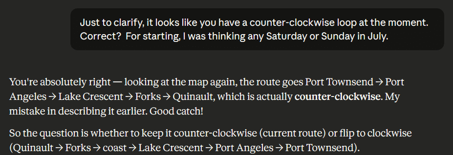
One of the lodging points that sounded really cool had some availability on a different day, so I asked it if it would make sense to reverse the route. It confused clockwise (its original) with counter-clockwise. I then plotted this on Google Maps and realized that Port Townsend and Port Angeles are not that far from each other, which made me wonder why it had recommended an overnight in Port Townsend.
Its response was “So when you visit Hurricane Ridge [in Olympic National Park] you can get there early, before crowds.” Okay, but looking at the map, I noticed the drive from Port Townsend to Hurricane Ridge was twice as long as from Port Angeles, so why not just drive the extra 40 minutes to Port Angeles (it’s not that far of a drive anyway), and skip Port Townsend. “Great Insight!” … then it slide the two days for Port Angeles back, but did not detect there was now a gap for the rest. Its response to “Is it worth spending three days in Port Angeles?” was “not really,” and then started pushing a visit to a B&B west because it has a “great breakfast place” … that was closed on the day we would be there. After some back and forth, I realized it was confused and booked what seemed intuitive to me.
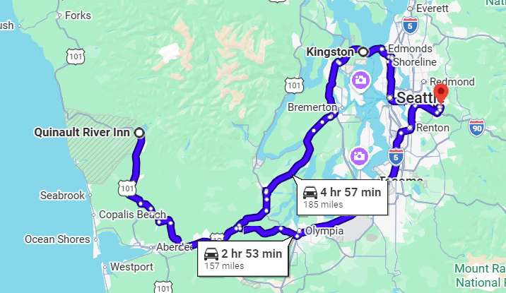
Upon regenerating the map, I noticed it had us going back to Port Townsend, adding two hours and 28 miles to the trip home.
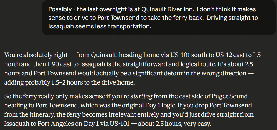
Grade: C- Because of the egregious errors, I would not rely on AI for travel planning. Things might change if it were able to access sites like booking to get some preliminary insight into availability and price.
TL;DR
It felt easier to interact with complete sentences rather than keywords, like one must do with search and chatbots. While good prompting helped, it was necessary to iterate. This worked especially well for coding tasks. In all tasks, I found significant errors in the AI-suggested answers, underscoring the importance of having someone double-check its work and, when it gets off track, redirect it.
In the one head-to-head test in Microsoft Power Point, the paid version of Claude performed much better than the paid version of CoPilot included with the Microsoft Office 365 subscription. I am hesitant to try an AI in Excel just yet as the data sets are not especially complex. It was nice being able to tell AI “Make all of the slide content areas have a similar top, left alignment.” I am less familiar with PowerPoint, but it sounds like there are many different ways to set style and these sometimes disagree.